
The Hierarchy of User Friction


As product designers we spend a lot of time trying to understand user friction and solve for it in the products we build. Doing so is absolutely critical to delivering delightful experiences for our users. I find though that sometimes teams are only perceiving and solving the most basic forms of user friction and aren't taking on some of the harder to perceive yet incredibly important higher level forms of friction that users are experiencing. So I wanted to share how I think about the hierarchy of user friction and provide examples and best practices for solving for each.
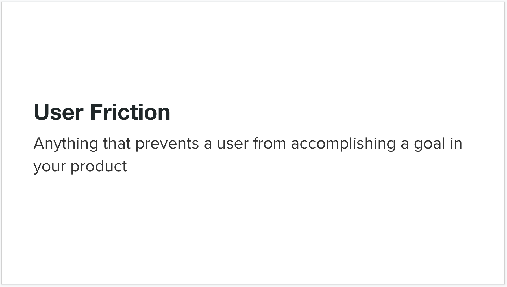
User friction is really anything that prevents a user from accomplishing a goal in your product. I categorize user friction into a hierarchy of three levels: interaction friction, cognitive friction, and emotional friction. Interaction friction is what I hear talked about most often amongst product designers, but the higher levels of cognitive friction and emotional friction are equally important to solve for to build a great user experience.
Interaction Friction
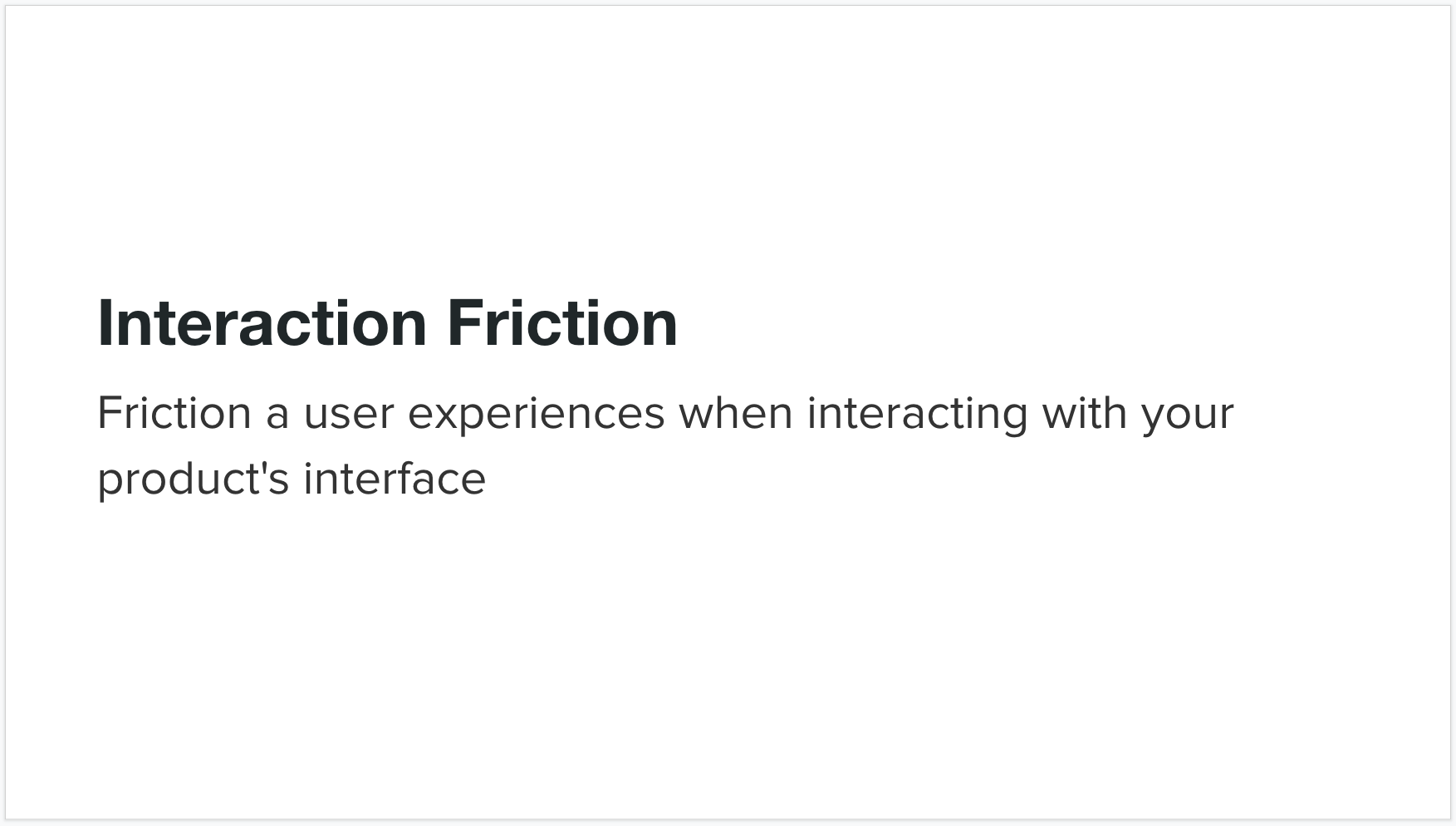
Interaction friction refers to friction a user experiences when interacting with your product's interface. It covers all aspects of the UI that may be hindering your users from accomplishing their goal.
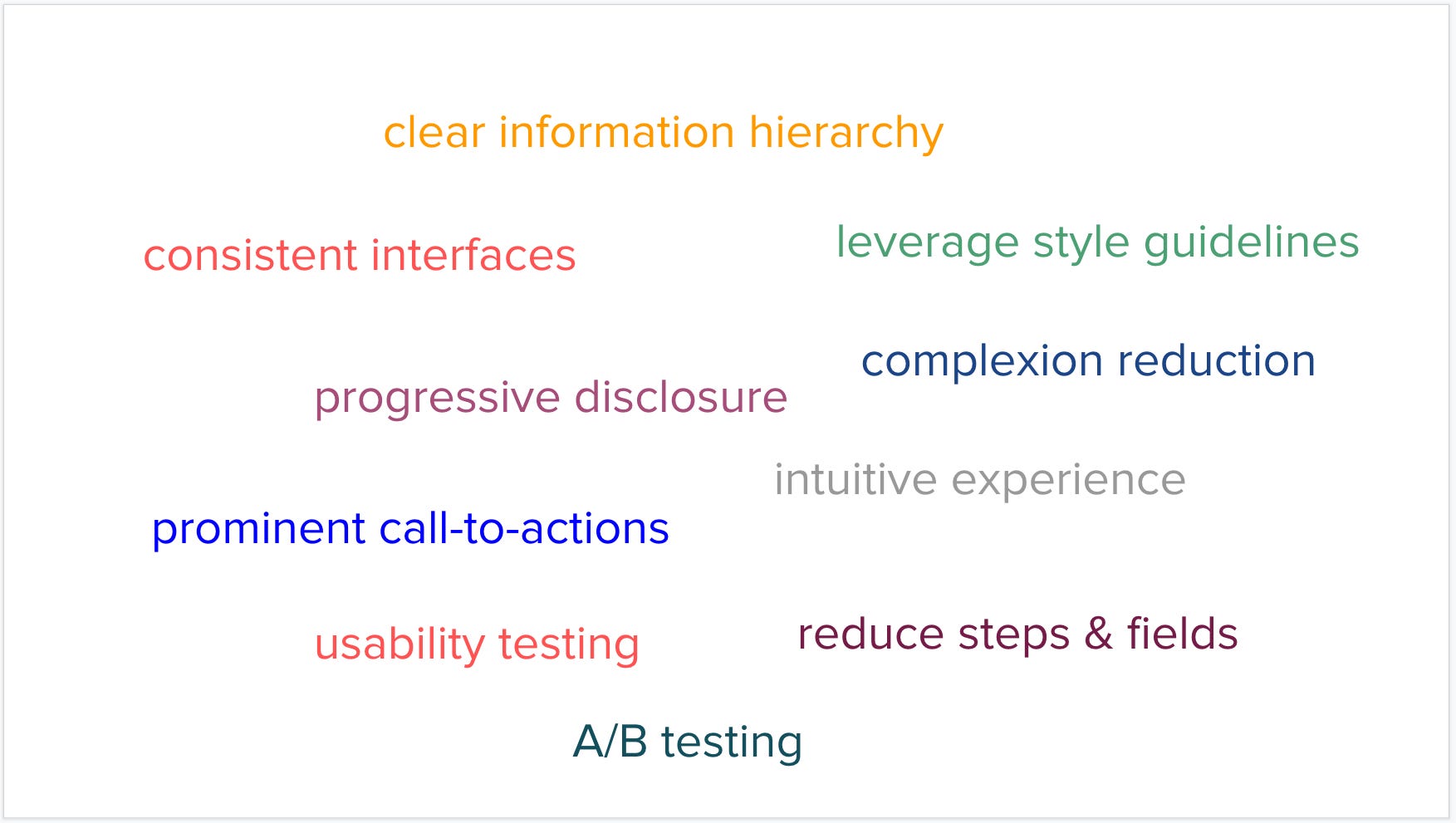
We strive to build intuitive and consistent interfaces to prevent interaction friction. We ensure our call-to-actions are prominent, we reduce the number of steps or fields in our forms, we leverage style guide lines to ensure we have a consistent UX across all of our experiences, and we try to do the work for the user so they don't have to whenever we can. These are just a few of the techniques that are commonly used to address interaction friction.
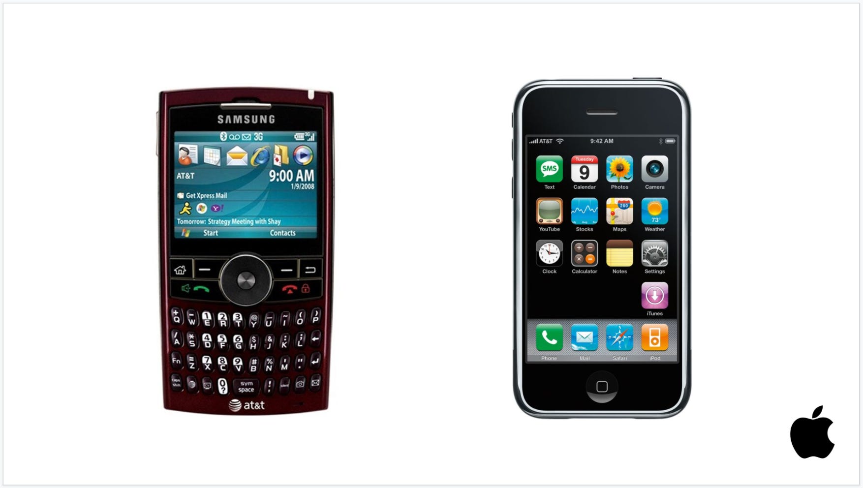
The canonical example of significantly reducing interaction friction remains the iPhone. Everyone knows that smartphones existed before the iPhone. We remember the days of the Blackberry or Windows Mobile devices that were technically email and web capable devices with a keyboard. And yet the iPhone changed everything. It was the first device to have a highly accurate on-screen keyboard thanks to their innovation in capacitive multi-touch screens. This freed up significant real estate on the screen when you weren't typing. They packed enough CPU power on the device to support a full web browser instead of the extremely limited web experiences that existed on smart phones before it. And most importantly, they made the entire software experience extremely intuitive, beautiful, and fast. And these improvements to the overall UX significantly reduced the interaction friction of every prior generation of smartphones and laid the groundwork for this new class of smartphone to become the predominant mobile device that everyone now carries around in their pockets.
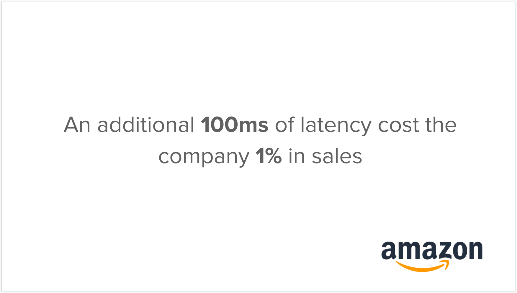
While the iPhone example illustrates how an entire industry can be redefined by solving for interaction friction, Amazon provides an example of how even the simplest of interaction friction can be a huge detriment to user experience. Amazon illustrates the incredible importance of site speed to online experiences. They found that they could increase revenue by 1% for every 100 ms of load time improvement. Think about that for a minute: such a small change in load time, 100 ms, could have such a dramatic impact on revenue for Amazon. It's a strong reminder that any type of interaction friction, especially page load time time, is important to address.
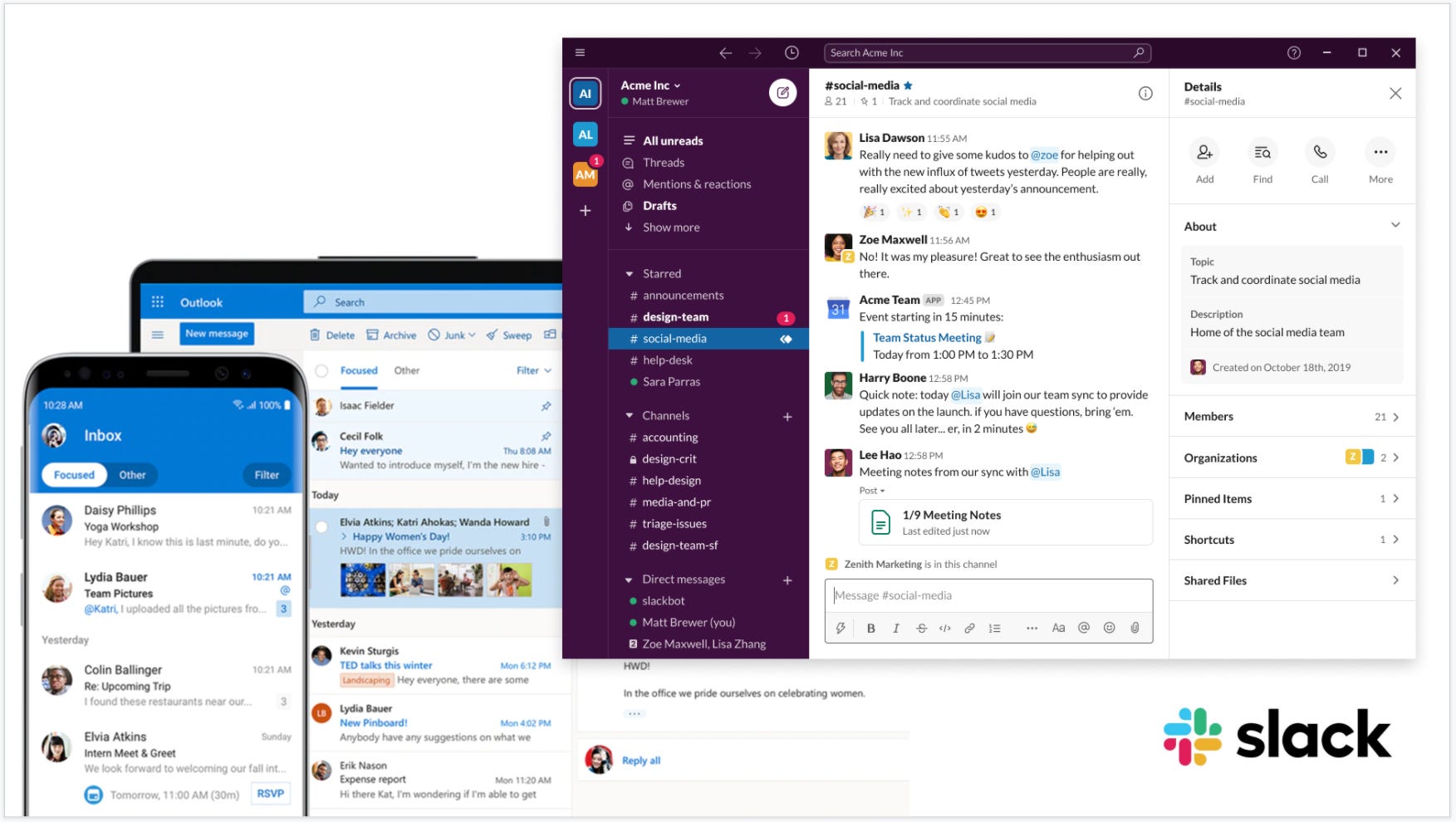
The rise of messaging apps like Facebook Messenger and WhatsApp as well as Slack and HipChat in the enterprise can also be attributed to a significant reduction in interaction friction compared to the alternatives at the time, including email and text messaging. You no longer had to worry about whether you had someone's most recent email address or phone number. You didn't have to think about coming up with a subject line. You didn't need to use many of the formalities that people had become accustomed to with email, including greetings and signatures. All of that was taken away and reduced to the simplest form a communication: find the person you want to message and simply start typing a message to them. We've taken this even further now with the use of emoji, which communicate far more in a single image than the alternative of having to type it all out.
Usability testing remains one of the most important techniques for identifying sources of interaction friction in your product and addressing it. When you watch end users using your product you'll undoubtedly discover friction points that you hadn't anticipated yourself. It's important to continue to leverage this technique not just the first time you launch a product, but continually as you iterate as well.
Keep reading with a 7-day free trial
Subscribe to Sachin Rekhi to keep reading this post and get 7 days of free access to the full post archives.